Visualising
I struggled learning to code. I can’t visualise systems in my head. I can’t picture how things work without seeing or touching it.
So when I don’t get something (which is fairly often), I don’t want a wall of text back - I can't process all that text. Instead, I ask for visuals I can play with.
I use them for all sorts: something new I want to get my head around, how someone else’s product works, how my own setup works, how all the bits of a project fit together, and what every screen of an app looks like.
Explaining concepts
For example, when learning about what an agent actually is there's a lot of parts to it. I hadn't actually seen anything that got me to fully understand it either. So in this situation I'd just use an agent to explain it visually.
i want to understand how agents actually work. what happens when i send one a message? the loop, tools, what it can see, how it remembers things, skills, instructions files like AGENTS.md. explain it like i’m someone who knows nothing about this topic, with big pictures and few words, in an interactive html file.
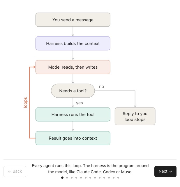
It’s an HTML file. The agent writes it, it opens in the browser, and it can have pictures, steps, buttons and tables, anything a website can. For explaining something, it's much better than just text.
The visuals helped me notice how much of 'an agent' is actually the harness. You’re not really talking to the model, you’re talking to it through the harness. The harness has the tools and controls what goes into the context. The model comes up with the steps, but the harness takes a lot of the actions by using tools and giving all the output back to the model to process. That’s why people keep saying the harness matters.
Someone else’s system
Personal agents are becoming popular, but everyone and their dog is launching one. So which do you pick? And why? And if I already use agents but not 'personal agents', do I need another one or can I just use what I have?
So I asked for a visual comparison.
i keep hearing about muse and instinct. i want to understand how each of them actually works under the hood. how they’re set up, what files they use, how they remember things, what tools they can use, what runs on my computer versus in the cloud, what it costs. make me an interactive html explainer comparing the two side by side.
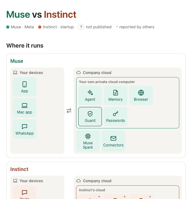
You can tweak these files with your agent easily, ask it to change sections, use fewer words and bigger pictures.
My own system
The way I look at agents is that it's basically just a folder with instructions. If your instructions say to behave like a Chief of Staff, any agent harness would.
I asked for my current setup as a comparison table to see what I'm potentially missing out on.
now do the same for my own personal agent in ~/bites. how is it set up, what files does it use, how does it remember things, what tools can it use, what runs where. show it next to muse and instinct so i can see how mine compares.
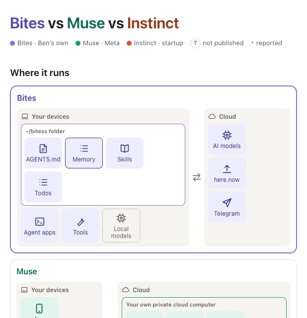
Side by side, there isn't much difference. Although I'd try them all to feel how they work and if it was something I wanted to use longer-term. I try a lot of tools, and like my building, I throw a lot a way. Try, experiment, throw or keep.
Draw it
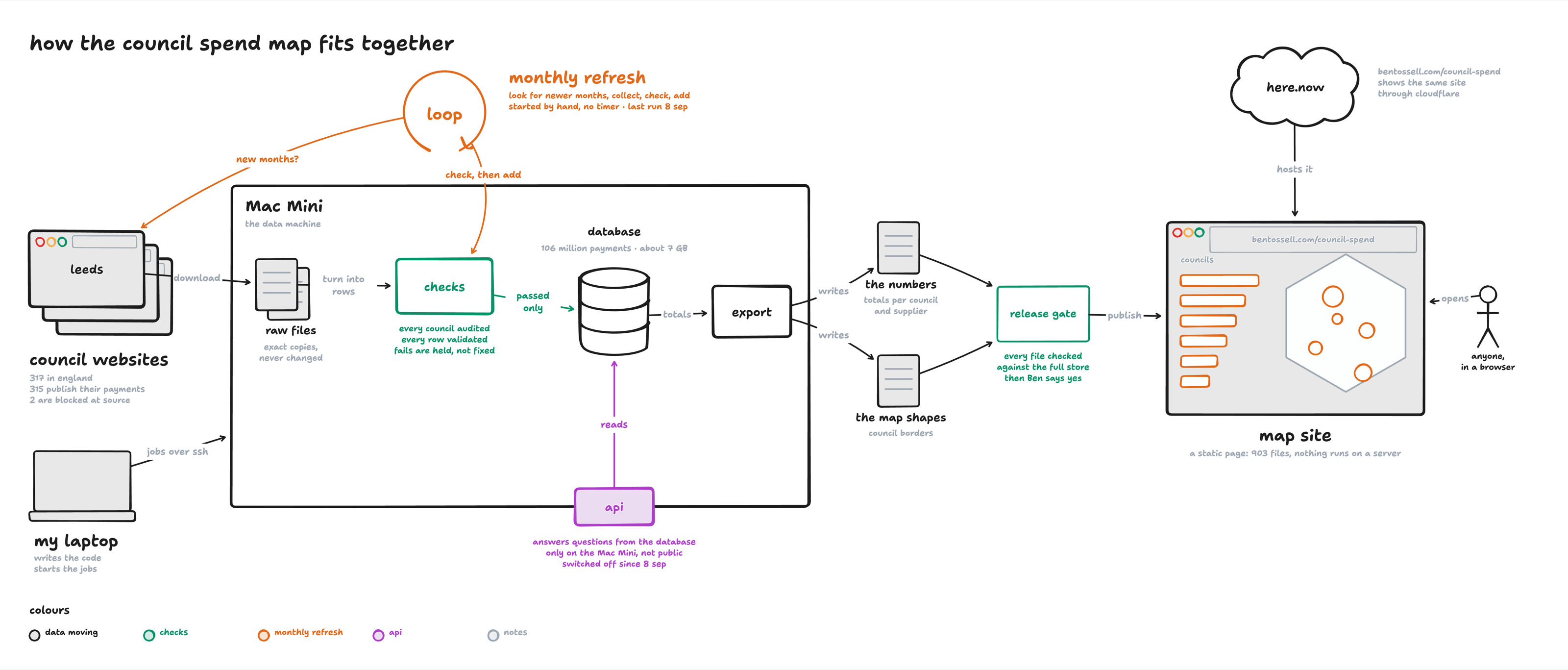
I built a more complex app to show UK council's spending, in the style of Apple Maps. It's complex because the data collection is different across all the council websites, with 100M+ rows of data which needs to be saved somewhere, then that data needs to be served on the site.
It's a bit above my technical understanding so I asked for a workflow image in tldraw. This lets me see the different pieces, how they connect to one another and where the data flows.
i want to see how the whole council spend map fits together. there are a lot of moving pieces. draw it on a tldraw canvas.
Every screen at once
When you click through an app, you only ever see one screen at a time. A contact sheet puts every screen on one page.
This maps out all the screens in your projects so you can see them all, how they connect to one another, and where there may be duplicate views or screens you want to improve. Often people may use this for something like user onboarding to see the steps and where people drop off.
now make me a contact sheet of every screen in the map site, desktop and phone, all on one page. i want to see them side by side so i can spot which screens are redundant or doing the same job, and what happens on one screen versus another.
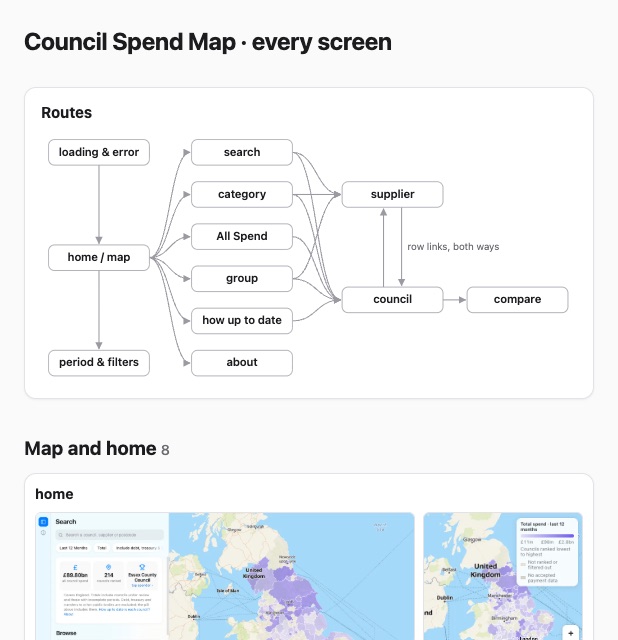
Doing this on the council map, I found two screens showing the same list, single payments turning up in three places, and an error message that never actually shows when the data fails to load. Now I can easily point my agent at it to fix.
Make it mine
The more you use little systems like visualising, the more a certain style or layout may resonate with you. Generally when you notice yourself asking for similar outputs or artifacts regularly, you can promote them to agent instructions or a skill.
These are some I’ve saved:
- The Unreasonable Effectiveness of HTML Thariqwhy an HTML page beats a wall of markdown when an agent explains something to you
- /eli5 Thariq“explain like I’m someone who knows nothing about this topic, using a HTML artifact with big pictures and few words”
- eli5-for-grownups Grace Clarkeher version of Thariq’s, with more rules on what “explain it simply” should and shouldn’t mean
- /show-me Dex Horthysmall pictures in the chat instead of walls of text, for when a whole page is too much
- explainers in Notion Geoffrey Litthis agents write explainer docs with interactive parts, so his team can talk about them
Notes
- I can’t picture how things work, so I ask for visuals instead of a wall of text.
- An HTML page on how agents work showed me how much of it is the harness.
- Personal agents side by side, then mine next to them.
- A tldraw canvas of how the council map fits together.
- A contact sheet of every screen, which found two screens doing the same job and an error that never shows.
- When I keep asking for the same kind of thing, it goes in my instructions or a skill.